Lead Boss Marketing is a dynamic real estate-focused brand created to empower agents, investors, and property professionals with a bold and confident identity. Our goal was to craft a strong visual presence that communicates authority, trust, and growth within the competitive real estate market.
We designed a modern, impactful logo paired with a comprehensive branding guide that defines color palettes, typography, and visual elements to maintain consistency across all platforms. The result is a brand system that reflects professionalism, ambition, and a results-driven mindset—positioning Lead Boss Marketing as a leader in real estate branding and marketing.
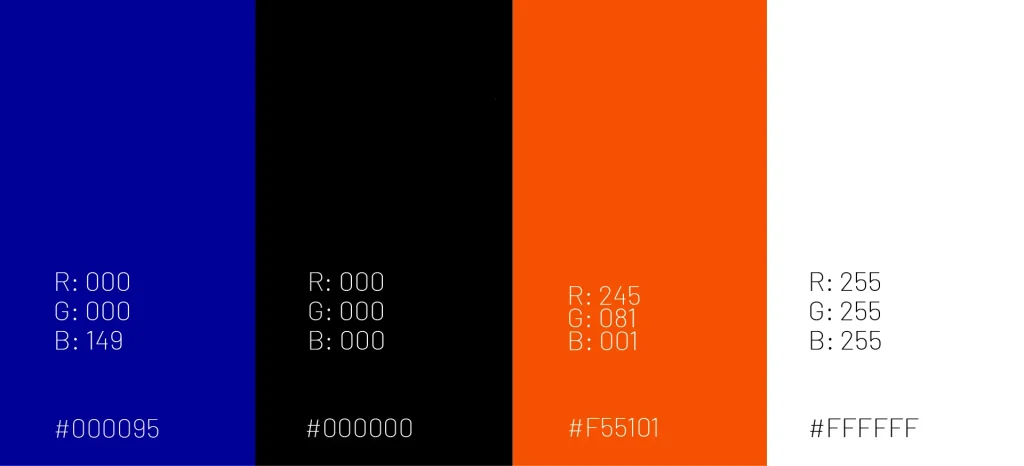
In the process of selecting colors and typography for Leadboss Marketing, we embarked on a thoughtful journey to encapsulate their brand essence. The color palette was meticulously curated to resonate with their mission in the marketing industry. Shades of blue were chosen for their symbolism of trustworthiness and reliability, while black adds a touch of sophistication and authority. Vibrant orange injects energy and creativity into the visual identity, representing innovation and effectiveness. These colors not only convey professionalism but also evoke a dynamic environment for marketing solutions.
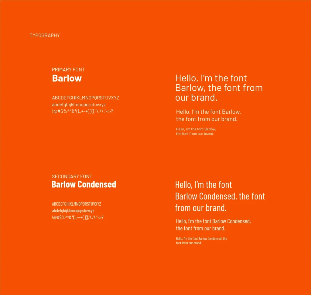
In typography, our approach balanced modernity with clarity. We carefully selected the Barlow and Barlow Condensed fonts to maintain a clean and contemporary look, reflecting Leadboss Marketing’s commitment to staying current and relevant in the digital landscape. The Barlow font provides a sleek and professional appearance, while the condensed variant adds a touch of versatility and efficiency to the brand’s communication. This fusion of colors and typography creates a distinct and memorable visual identity for Leadboss Marketing, ensuring they stand out in a competitive market while remaining approachable and effective.
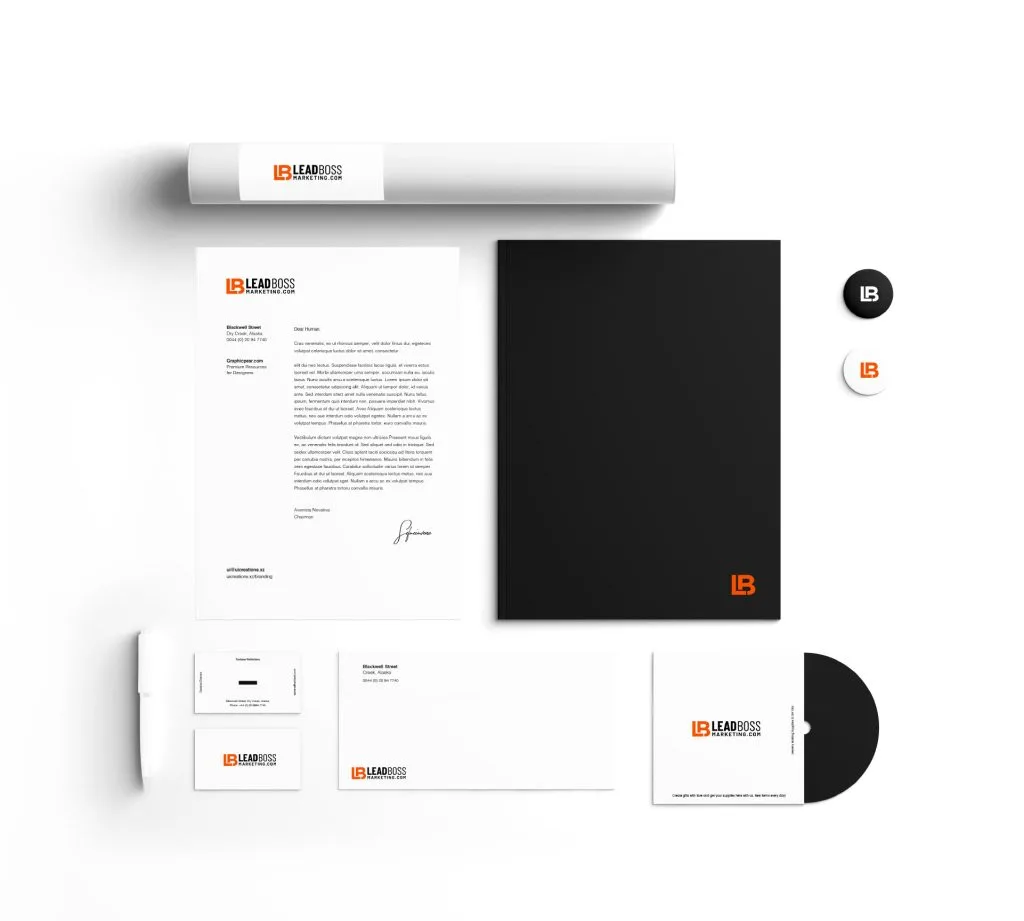
Our meticulous attention to detail extended to the development of Leadboss Marketing’s stationery, a tangible embodiment of their brand identity. Each element, from letterheads to envelopes, was designed with precision and consistency. The use of the brand’s carefully chosen color palette and typography ensured a cohesive and professional appearance across all stationery items. These materials serve as more than just functional tools; they convey a lasting impression of innovation and reliability, leaving a positive mark with every interaction. Leadboss Marketing’s stationery reflects their commitment to excellence and leaves no doubt about their dedication to providing high-quality marketing solutions.
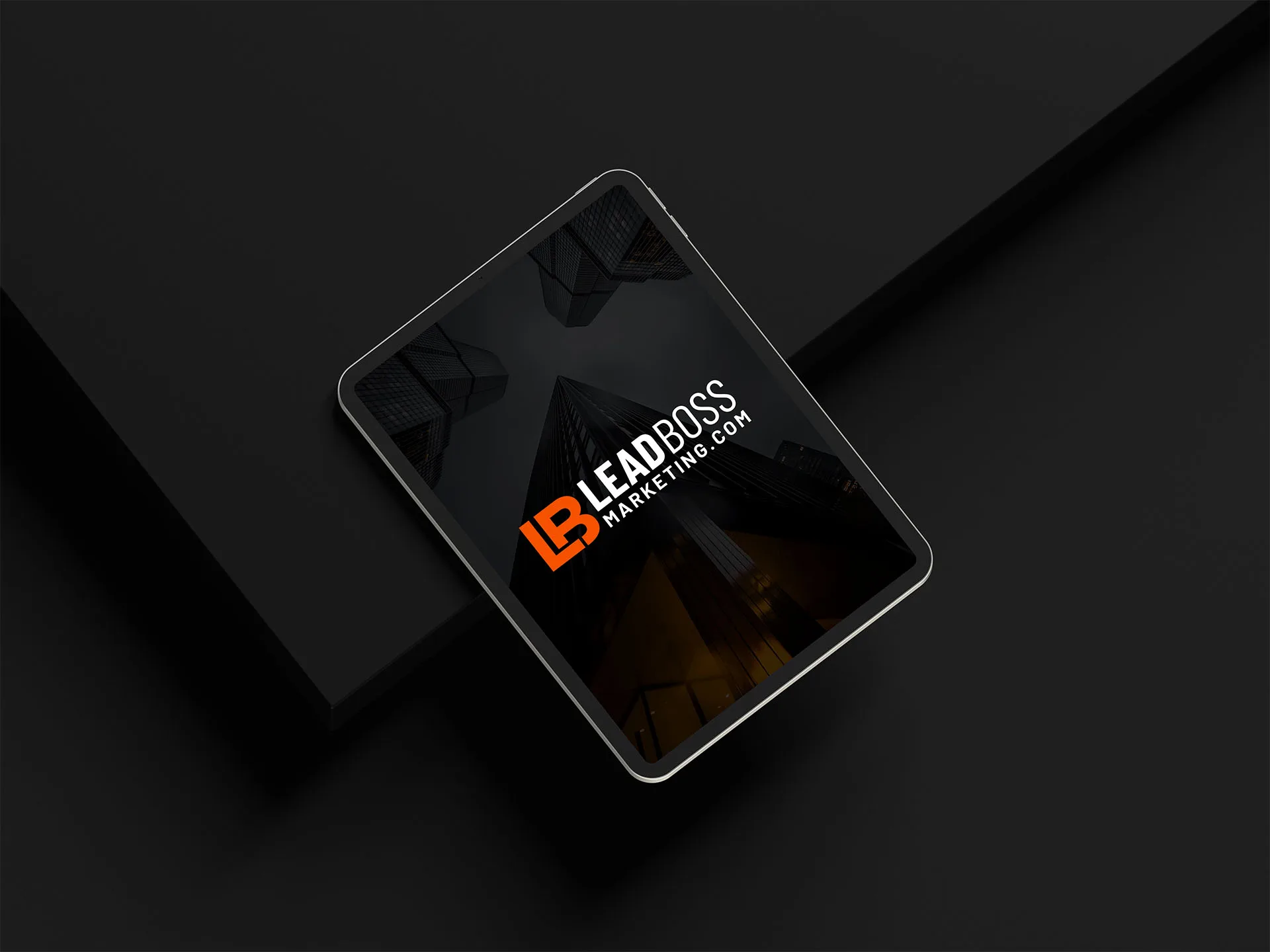
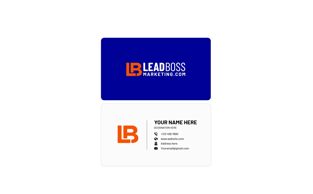
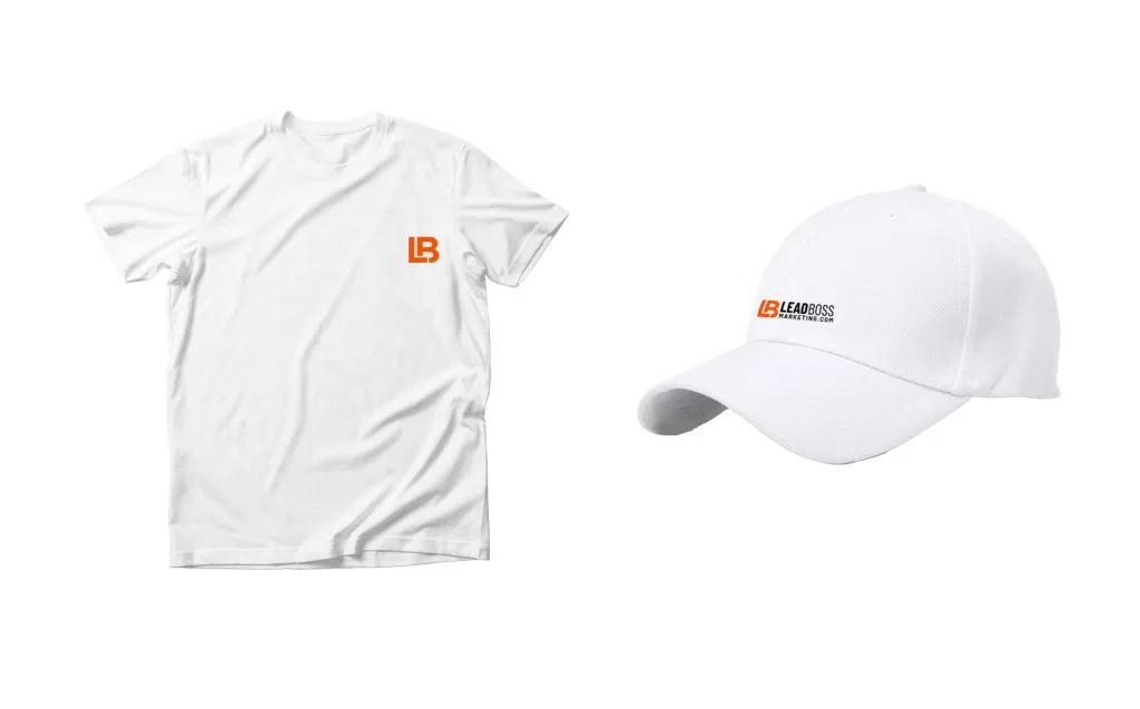
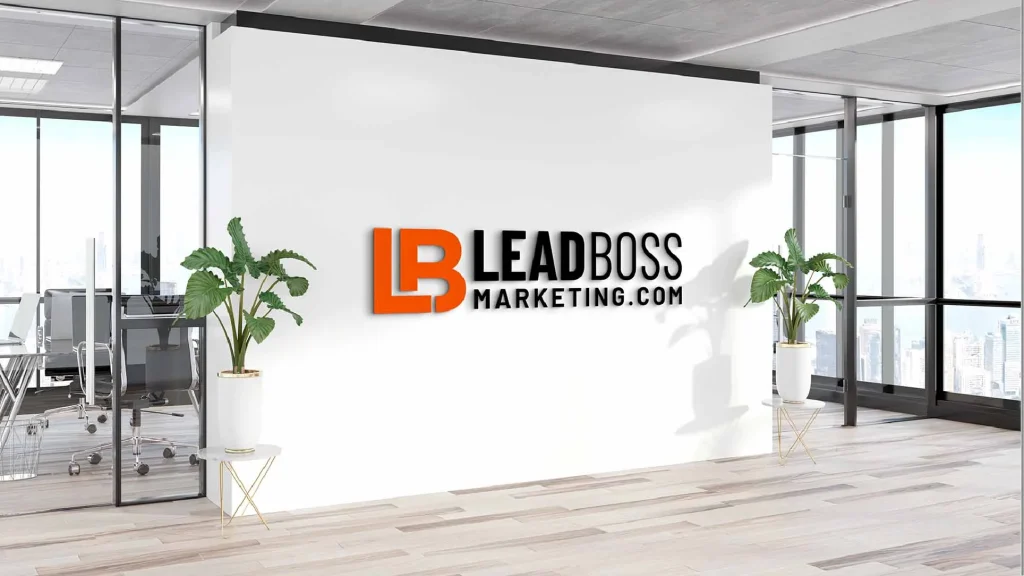
Leadboss Marketing’s business cards exemplify the power of a well-executed visual identity. By integrating the logo, colors, and typography, we crafted business cards that not only provide essential contact information but also serve as mini brand ambassadors. The design is clean, modern, and memorable, making a strong first impression in networking and professional settings. Beyond business cards, we extended our design expertise to various mockups, including merchandise and digital interfaces. These mockups illustrate how the branding elements seamlessly translate into real-world applications, reinforcing Leadboss Marketing’s consistent and impactful presence across different touchpoints, whether physical or digital.
With thorough research and meticulous effort, we have successfully crafted an exceptional branding and logo for Leadboss Marketing. This visual identity not only encapsulates their values but also positions them as a trusted authority in the marketing industry. We are proud to have been a part of this journey and look forward to seeing Leadboss Marketing thrive with their newfound brand strength. Thank you for entrusting us with this project.
We place huge value on strong relationships and have seen the benefit they bring to our business. Customer feedback is vital in helping us to get it right.
Addons is a real early-stage software looking for an analytics platform that scales with you, check out our stage program.