Project Brief
Wizmedia.studio proudly crafted the logo and branding guide for Investor Harvest, a dynamic real estate education platform. Investor Harvest empowers individuals with the knowledge and tools needed to thrive in the world of real estate investment. Our design embodies their commitment to growth and success in this thriving industry.
Client
Investor Harvest

Logo creation process
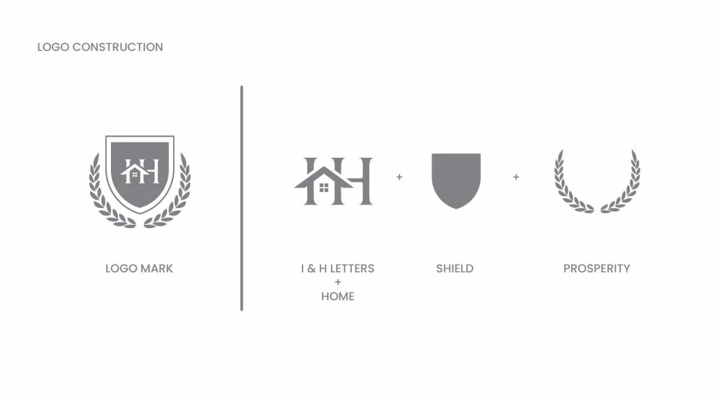
The logo creation process for Investor Harvest began with thorough research into real estate and education trends. We conceptualized several ideas, sketched initial designs, and refined them digitally. A careful selection of fonts, colors, and icons was made to convey professionalism and growth. The final logo embodies the essence of real estate education and Investor Harvest's mission.
Color Palette and Typography
In the process of selecting colors and typography for Investor Harvest, we embarked on a thoughtful journey to encapsulate their brand essence. The color palette was meticulously curated to resonate with their mission in the real estate education sphere. Rich shades of blue were chosen for their symbolism of trustworthiness and dependability, while vibrant greens injected a sense of growth and prosperity into the visual identity. These colors not only convey professionalism but also evoke a welcoming environment for learning and investment.
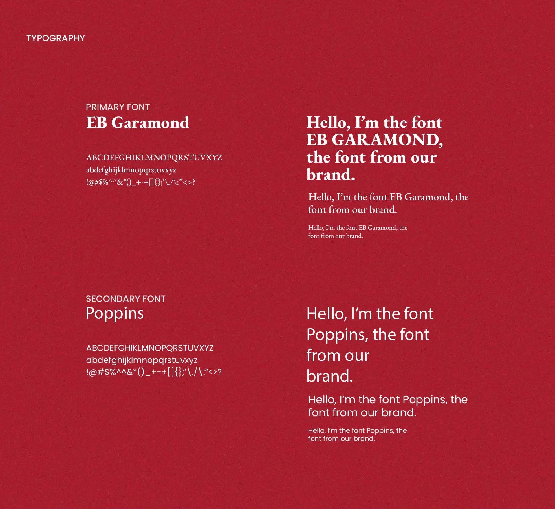
In typography, our approach balanced modernity with approachability. We carefully selected sans-serif fonts to maintain a clean and contemporary look, reflecting Investor Harvest's commitment to staying current and relevant. Additionally, we introduced a unique script font to infuse a personalized, human touch into their branding, emphasizing the human connection and guidance they offer to their community. This fusion of colors and typography creates a distinct and memorable visual identity for Investor Harvest, ensuring they stand out in a competitive market while remaining approachable and trustworthy.

Stationery Creation:
Our meticulous attention to detail extended to the development of Investor Harvest's stationery, a tangible embodiment of their brand identity. Each element, from letterheads to envelopes, was designed with precision and consistency. The use of the brand's carefully chosen color palette and typography ensured a cohesive and professional appearance across all stationery items. These materials serve as more than just functional tools; they convey a lasting impression of trust and reliability, leaving a positive mark with every interaction. Investor Harvest's stationery reflects their commitment to excellence and leaves no doubt about their dedication to providing high-quality real estate education.
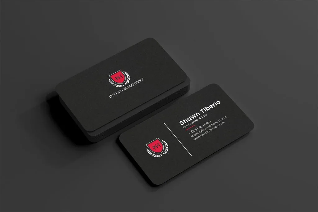
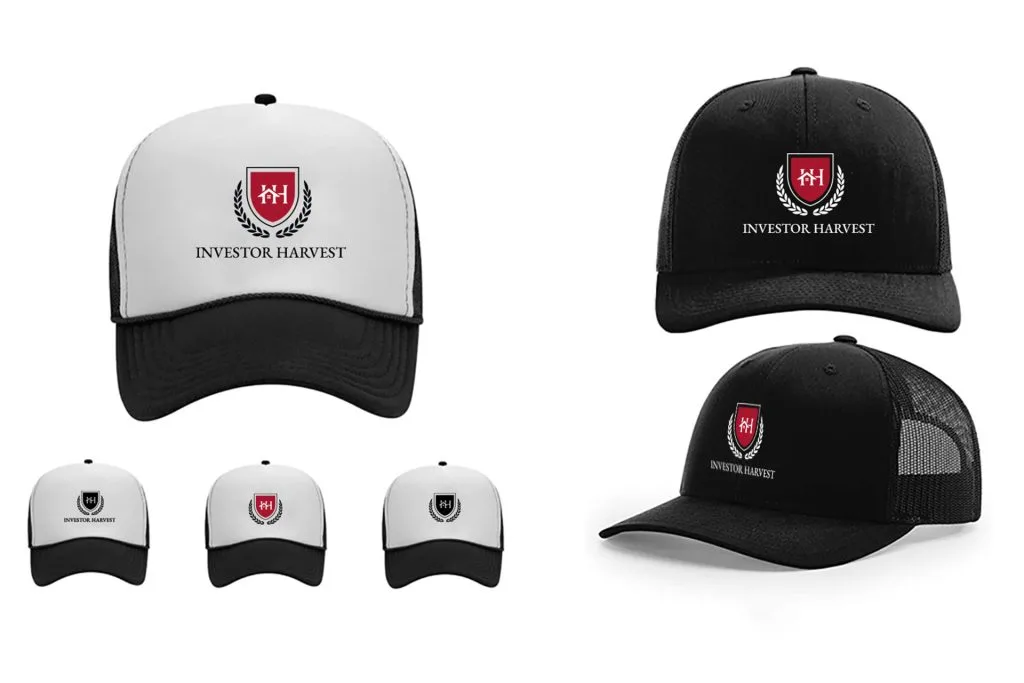
Business Card Creation and Other Mockups:
Investor Harvest's business cards exemplify the power of a well-executed visual identity. By integrating the logo, colors, and typography, we crafted business cards that not only provide essential contact information but also serve as mini brand ambassadors. The design is clean, modern, and memorable, making a strong first impression in networking and professional settings. Beyond business cards, we extended our design expertise to various mockups, including merchandise and digital interfaces. These mockups illustrate how the branding elements seamlessly translate into real-world applications, reinforcing Investor Harvest's consistent and impactful presence across different touchpoints, whether physical or digital.
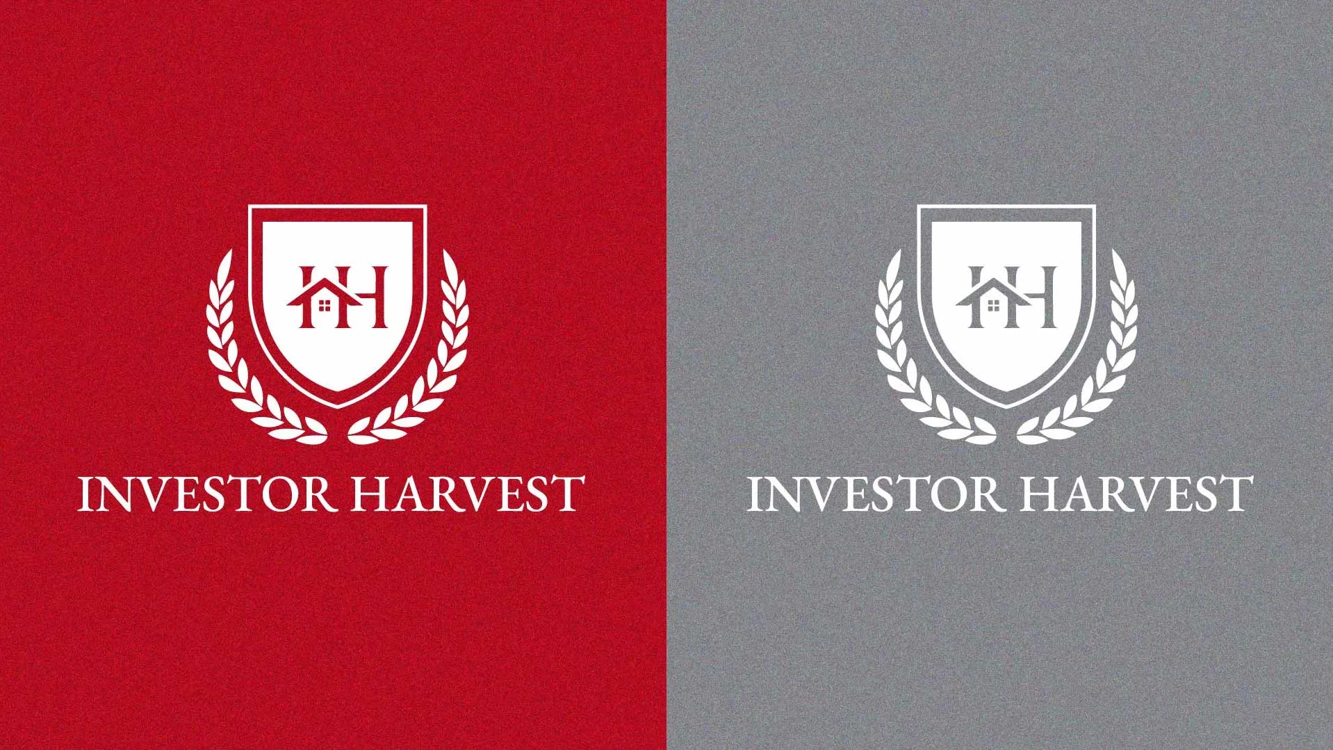
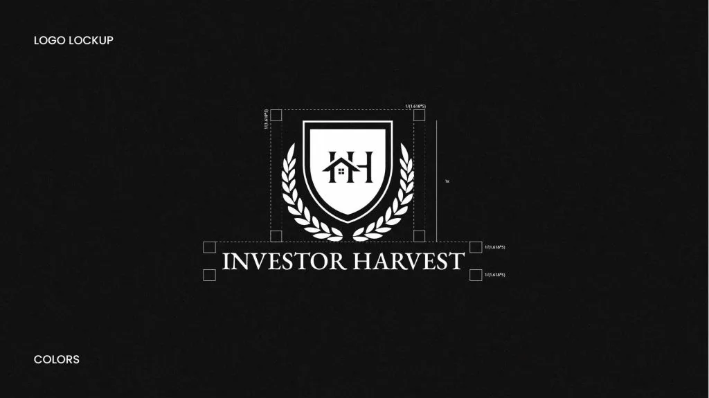
Logo Usage
The Investor Harvest logo, expertly crafted by Wizmedia.studio, is the bedrock of their visual identity. Its adaptability across various platforms, from digital to print, ensures brand consistency and recognition. Whether in full color or grayscale, it exudes professionalism and trust, serving as a symbol of their expertise in real estate education. This logo embodies Investor Harvest's unwavering dedication to excellence, making it a powerful asset for building a credible and memorable brand presence.
Results
With thorough research and meticulous effort, we have successfully crafted an exceptional branding and logo for Investor Harvest. This visual identity not only encapsulates their values but also positions them as a trusted authority in the real estate education industry. We are proud to have been a part of this journey and look forward to seeing Investor Harvest thrive with their newfound brand strength. Thank you for entrusting us with this project.